Curtains are one of the largest areas of colour in a room. They can quietly connect the walls and floor, frame the garden or give an architectural window a confident presence. Begin with the feeling you want to live with.
Guidance from Apex Curtains · For architectural windows and considered interiors
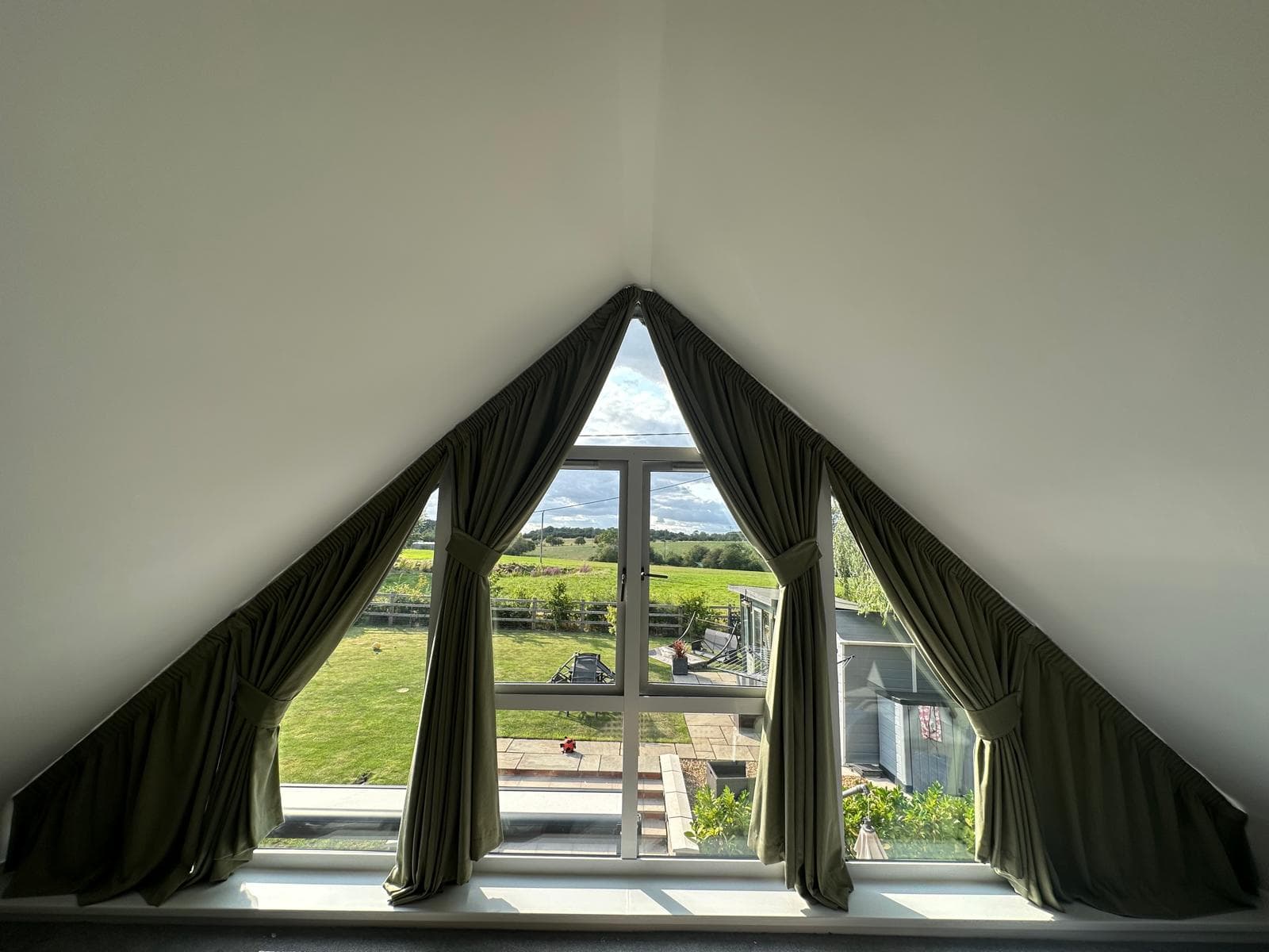
Olive, chalk and the garden beyond · A related palette makes the window feel part of the room.
The Apex colour studio
Find the feeling. Then find the cloth.
Explore a colour family, then shape it around your room. Real Oslo fabrics by Prestigious Textiles, considered finishing details and inspiration from Apex interiors.
Illustrative palette colours. Make the final choice from a physical fabric sample.
Now exploring / Neutrals & creams
Neutral curtains, beautifully layered
Cream, ivory and chalk give architectural glazing a quiet frame. A pale curtain can connect the walls across a double-height room, while woven texture and the shadows between folds keep the scheme from feeling flat.
ChalkPale oakStone
A starting palette to compare against your own walls, floor and furniture.
PT fabric photography represents 140 cm of width × 1 metre of length. These reduced swatch previews preserve the supplied image proportions; they are not life-size samples or a simulation of a finished curtain. A weave seen up close can read as a quieter surface from the floor of a tall room.
Oslo is a woven 50% cotton / 50% polyester fabric. PT lists a nominal width of 140 cm, with 138 cm usable, and no pattern repeat. “Linen” is an Oslo colour name, not its fibre composition. Confirm the current specification, shade availability and physical sample with Apex before ordering.
Fabric imagery and colour references: Prestigious Textiles, Oslo ↗. Colour groupings and interior suggestions are Apex editorial guidance.
Make it your room
A colour is only the beginning.
These choices refine the design guidance. They do not restrict which Oslo colours you can choose.
Modern · Neutrals & creams
Let the glazing and a restrained colour palette lead. A clear heading rhythm and tonal tiebacks give the cloth a composed architectural line.
Gable / apex room. Design around the roofline, stack-back and visible glass. A close wall tone can quieten the outline; a deeper curtain makes the geometry more prominent.
Calm. Reduce the contrast between the curtain, walls and floor. Let a limited palette and the texture of the cloth provide interest.
North-facing. Often cooler and more even in UK rooms. Compare warm and cool undertones beside the window; outdoor reflections and obstructions can matter as much as orientation.
Illustrative proportions only. This is not an Oslo colour rendering, an installation photograph or a prediction of opening clearance. Actual curtain shape and stack-back depend on the surveyed window.
Notice how closing the curtains increases the area of colour. The evening setting changes the surroundings; it does not predict how a particular fabric will react to your lamps.
Choose standard, blackout or thermal blackout lining for the room's needs. Compare the lining behind your colour sample before deciding. A coloured reverse is a separate design choice, especially where it becomes visible.
Matching tiebacks keep the silhouette quiet. White track is the usual starting point beside pale ceilings; check how the lining changes the face colour in daylight.
Look at the way the cloth sits with the architecture, furniture and view. These are real Apex installations; their fabric ranges are not identified here as Oslo.
Open a family for material pairings, tall-window considerations and finishing ideas. Each guide belongs to this connected colour collection.
Neutral curtains, beautifully layered
+
Cream, ivory and chalk give architectural glazing a quiet frame. A pale curtain can connect the walls across a double-height room, while woven texture and the shadows between folds keep the scheme from feeling flat.
Works well with
Try warm white walls, pale oak and limestone. Compare creamy whites against your paint: a yellow undertone can become more noticeable beside a cool, crisp white.
Think about scale
In a large gable, a slight difference between wall and curtain is often enough to make the shape legible. Bring depth through the heading and the texture of upholstery rather than adding many competing colours.
Complete the scheme
Matching tiebacks keep the silhouette quiet. White track is the usual starting point beside pale ceilings; check how the lining changes the face colour in daylight.
Oat, putty and mushroom bridge pale walls and darker furniture. These are useful colours when the room needs softness without a pronounced new hue. Taupe can lean pink, green or grey, so its neighbours matter.
Works well with
Lay samples beside oak, travertine and the sofa. A warm beige can bring honey-coloured timber into the scheme; a greyer taupe may sit more naturally with weathered wood.
Think about scale
For open-plan rooms, repeat a related neutral in a rug or dining chair to connect separate zones. Compare the curtain closed as a large surface as well as gathered at the sides.
Complete the scheme
A slightly deeper matching tieback defines the folds subtly. A coloured reverse can add interest where the curtain turns back; choose its light-control performance separately from its colour.
Grey can be soft and stony or crisp and architectural. Blue-grey beside concrete feels different from warm greige beside oak. Avoid choosing from the word grey alone: compare the actual fabric with the fixed materials in the room.
Works well with
Warm timber and ivory upholstery can balance a cooler grey. With chrome, steel or black window frames, use texture to soften the harder edges rather than trying to match every metal finish.
Think about scale
On tall glazing, a medium grey makes the folds easy to read without the visual weight of charcoal. In lower light, check that your chosen grey does not appear much darker than expected.
Complete the scheme
White track can recede into a pale ceiling. The optional black finish can relate to dark frames when the track is visible; it need not match chrome or brass furniture hardware.
Sage, olive, moss and deep green offer different ways to connect a room with the landscape. Sage feels muted and airy; olive adds warmth; moss gives depth. The Oslo examples below explore olive and yellow-green directions, rather than representing every green subtone.
Works well with
Chalk walls, natural oak and warm stone let green take the lead. A small clay or muted pink accent can add contrast. Check the reflected colour of planting outside before settling on the shade.
Think about scale
Green is particularly worth exploring around gable glazing with a garden view. Keep the rest of a double-height room relatively quiet if the curtain is a strong, saturated green.
Complete the scheme
Matching tiebacks make a continuous sweep; a warm neutral contrast brings the wall palette into the cloth. Compare coloured lining where the reverse shows, alongside the required light control.
Pale blue can open up a quiet scheme; deep blue gives glazing a stronger frame. A muted blue need not make a room feel cold when warm wood, cream and textured upholstery provide balance.
Works well with
Explore blue with oak, ivory or restrained terracotta accents. Black frames sharpen the outline; warmer metals add a different note without needing to appear in the curtain fabric itself.
Think about scale
View deep blue from the doorway and seating position. A small sample can feel understated while a full curtain becomes the largest dark surface in the room, especially after sunset.
Complete the scheme
For a bedroom, assess blackout or thermal blackout lining with the chosen blue; dark face fabric alone is not a blackout specification. Matching tiebacks keep attention on the long folds.
Dusty rose and muted blush can warm a room without a sugary effect. Their grey or earthy undertones work especially well when balanced with quieter walls and natural materials.
Works well with
Try rose with chalk, walnut or a muted green accent. Compare pink cloth beside red-toned timber carefully: two similar warm undertones can either connect beautifully or compete.
Think about scale
In bedrooms and sitting rooms, a muted pink can soften strong glazing lines. On a very tall curtain, start with a generous sample so you can judge the intensity across a larger area.
Complete the scheme
Matching tiebacks create a gentle finish. A deeper rose or neutral contrast is a more deliberate detail; check it against the lining at a folded edge before choosing.
Clay, rust, tobacco and brown echo natural building materials. They can give a contemporary room warmth or sit comfortably with a country interior's timber, brick and stone.
Works well with
Combine a warm curtain with chalk walls and one darker timber note. Terracotta with muted blue creates controlled contrast; brown beside textured cream offers a quieter layered palette.
Think about scale
In a large gable space, distinguish warm colour from sheer darkness. A terracotta curtain can be lively in strong daylight, while deep brown may read as a substantial frame in the evening.
Complete the scheme
Keep tiebacks tonal for a settled look, or introduce a restrained pale contrast. Consider white track against plaster and black as an optional upgrade where it connects with exposed dark metal.
Butter, straw and ochre can bring warmth to a scheme. Muted shades sit more quietly than clear yellow, particularly when the curtain occupies a large part of the wall.
Works well with
Explore cream, warm stone and natural timber. A little blue or charcoal can keep a golden scheme balanced. Brass accessories may echo the warmth without requiring a shiny fabric.
Think about scale
Check yellow in the room's evening lamps as well as daylight. Warm lighting can intensify its golden character; a large south-facing window can make a light shade appear much brighter.
Complete the scheme
Tone-on-tone tiebacks avoid breaking up a long curtain. Assess the lining behind the sample: the backing and transmitted light can change the colour you see.
Wine, oxblood and clear red make a confident focal point. A muted burgundy can feel enveloping, while brighter red introduces more energy. Choose the amount of colour as carefully as the shade.
Works well with
Balance deep red with warm white, dark timber or quiet stone. A restrained brass detail can add warmth. Avoid introducing several equally strong colours unless a deliberately lively interior is the aim.
Think about scale
Dining rooms and evening spaces can carry a richer palette, but tall glazing increases its visual area. Judge a closed-curtain scheme under the lamps used for dining, not only in midday sun.
Complete the scheme
Matching tiebacks maintain depth; a small contrasting edge makes a more decorative statement. If blackout is needed, specify the lining and edge coverage rather than relying on the darkness of the red.
Charcoal, black and deep brown bring definition to a tall window. A dark curtain can sit with black frames as one architectural composition, or create a striking boundary against pale plaster.
Works well with
Use differences in texture to stop the scheme feeling flat: matte walls, woven cloth, timber and softer upholstery. Introduce a lighter surface where you want the eye to rest.
Think about scale
Look at how much glass remains visible when the curtains are open. A large dark stack has a strong presence even when drawn back; open and closed proportions both belong in the design conversation.
Complete the scheme
Black track is an optional upgrade that can relate to dark frames; white remains the normal finish. A pale lining may show at the edge, so review the reverse and tieback position together.
Soft blue, blush and pale aqua can add colour with less contrast. They work best when their undertones connect with the room, rather than when every finish is simply made pale.
Works well with
Try pale timber, chalk and a little darker detailing to define the scheme. Muted colours can sit together more easily than highly saturated ones, but still compare them in the actual light.
Think about scale
In Scandinavian or minimal interiors, a pastel curtain can be the single gentle colour note. On high glazing, folds and lining give the pale surface its structure; consider that depth as part of the palette.
Complete the scheme
White track and matching tiebacks can keep the composition light. For sleep spaces, a pastel face fabric can still be combined with blackout lining, subject to light gaps around the installation.
Bring your favourite Oslo colours into the consultation. Compare them with the walls and floor, with the proposed lining behind, and with enough cloth to see the folds.
Orientation gives you a starting point, not a complete prediction. In UK homes, north-facing rooms often have cooler, more even daylight, while south-facing glazing may receive stronger direct sun. Buildings, trees, tinted glass and reflected colours outside can alter both. Check the actual room before using a warm or cool colour to balance it.
East-facing rooms can be brightest in the morning; west-facing rooms can take on warmer late-day light. Visit the sample at different times. In a double-height room, the upper cloth may be in direct sun while the lower folds sit in shade, so one curtain can show several values of the same colour.
At night, the light source changes again. Warm lamps can emphasise gold, cream and red undertones; cooler lamps can make a different part of the palette stand out. Compare the sample with the lamps and dimming levels you intend to use. A screen preview cannot reproduce those conditions.
Style is a useful conversation about proportion, texture and contrast. It does not mean a colour belongs to only one kind of home. The same warm neutral can feel minimal with a quiet heading or more traditional with a structured pleat and a defined tieback.
Curtains within different interior directions
Interior direction
What to consider
The finishing decision
Modern & contemporary
Clear architectural lines, a restrained palette and a deliberate texture
A consistent heading rhythm; decide whether the track should recede or relate to the frames
Traditional
Defined folds, timber and the scale of existing decoration
Proportion the tieback to the curtain and review any contrasting edge beside other trims
Minimal
A close wall-to-curtain tone, fewer strong contrasts and well-planned stack-back
Subtle texture and precise dressing give a quiet scheme its depth
Luxury
Generous but workable proportions, beautiful handle and balanced materials
Assess lining, heading, hems and tiebacks together; quality is visible in the finishing
Country
Stone, warm timber, garden greens and softer textures
A relaxed appearance still needs stable fabric and appropriate support at a tall drop
Industrial
Brick, steel, concrete and softened acoustically hard-looking surfaces
Consider optional black track beside dark frames, with fixings designed for the actual substrate
Scandinavian
Pale timber, useful daylight and gentle or muted colour
Keep the outline light and assess privacy without assuming pale fabric is opaque
In a living room, begin at the sofa: this is where the curtain, walls and view are usually seen together. In a dining room, compare the colour under the evening lighting. The most useful palette is one that works when you actually use the space.
Bedrooms add a separate light-control requirement. A dark colour is not a substitute for blackout lining, and a pale face fabric can still be made with blackout lining. The track position, sides, returns and hem clearance determine where environmental light may remain visible.
In open-plan interiors, use a repeated undertone to connect zones rather than repeating exactly the same fabric everywhere. A curtain may be viewed from the kitchen, dining table and seating area; check it alongside the materials in each view.
Double-height and gable rooms ask more of a scheme. The curtain can become a large vertical field of colour, and the stack remains visible when open. Review a hanging sample from ground level, how the cloth follows the roof slopes and how much glass is left uncovered when drawn back. A drawing of the proposed arrangement makes this easier to judge.
Begin with the elements that will stay: flooring, stone, timber, a favourite sofa or a view. These provide a more useful starting point than choosing a curtain colour in isolation. A warm oak floor, cool grey stone and a creamy wall each influence how the same fabric is perceived.
Decide what role the curtains should play. A close tonal relationship with the walls creates continuity; a deeper value frames the glazing; a contrasting colour makes the cloth a focal point. In an apex room, the curtain already has a strong outline, so colour does not always need to make another statement.
Build the scheme from a small number of relationships rather than trying to match every object. Repeating a curtain undertone in a cushion, artwork or rug can connect the room without making it feel coordinated to the point of sameness.
05 / The details
Hue, tone and undertone: the useful distinctions
Hue is the colour family: green, blue, red and so on. Value describes how light or dark it appears. Saturation describes its intensity. An olive and a vivid grass green belong near one another in hue, but their different intensity gives them a very different presence in an interior.
Undertone is the subtle cast that becomes clear beside another material. An ivory can lean yellow, pink or grey; a stone fabric can feel warm beside blue paint and cool beside honey-coloured timber. This is why two materials described as beige may sit awkwardly together.
Instead of judging one sample alone, place your shortlisted fabrics beside the actual wall and floor. Compare both the lit surface and the shadow of a fold. The darker valleys between pleats are part of the curtain’s colour in the room.
Three ways curtains can relate to an interior
Approach
Example
Effect to explore
Tonal
Oat curtains beside warm limestone walls
A continuous, restful envelope
Related colours
Olive cloth with muted blue-green accents
Gentle variety with a shared colour family
Controlled contrast
Muted blue curtains with warm terracotta details
A stronger focal point balanced by quieter surfaces
06 / The details
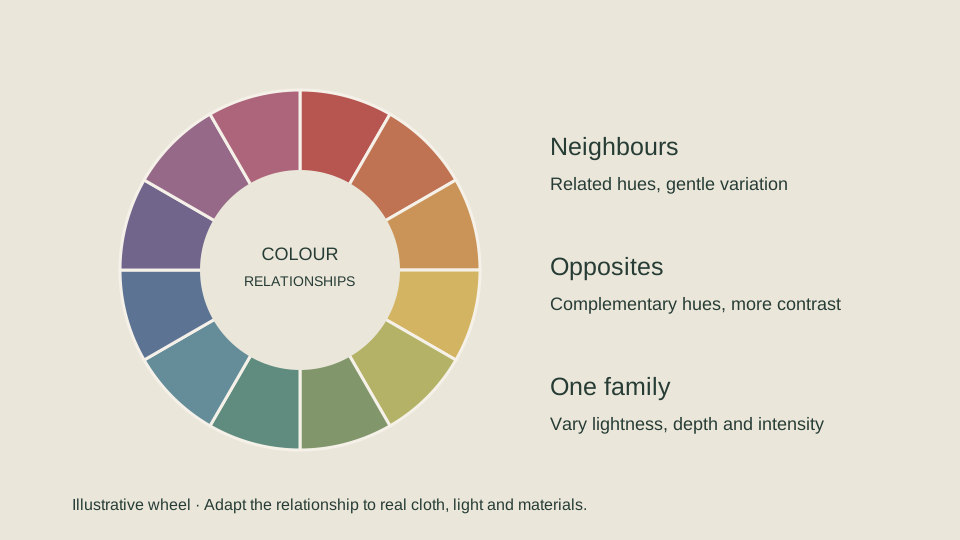
Use the colour wheel as a conversation
Neighbouring colours on a wheel can form a related, or analogous, palette: green with blue-green, for example. Opposite colours create a complementary relationship, such as blue and orange. A single colour family explored in lighter, darker or more muted versions creates a tonal scheme.
An interior rarely needs the pure colours shown on a teaching wheel. Muted olive, dusty blue, clay and ochre can use the same relationships with less intensity. The amount of each colour matters too: a large curtain in one colour and a small accent in its complement is different from dividing the room equally between them.
Use the wheel to understand a relationship, then return to real materials. Timber, reflected daylight, weave and pile cannot be represented by a flat colour sector. The right result is the one that feels balanced in your room.
A simplified colour wheel. Neighbours suggest related palettes; opposites suggest contrast. Fabric samples remain essential.
07 / The details
Warm neutrals: quiet, with depth
Ivory, oat, putty and limestone can give a room a calm background. Their success depends on the undertones and texture rather than the absence of colour. A chalky wall with a woven oat curtain and natural timber can feel layered even when the colours are close.
For a large gable, a curtain near the wall tone can soften the height without creating a strong colour boundary. Choose a slightly deeper value if you want the folds to remain visible. If every surface is pale and smooth, introduce a weave or a more defined heading to avoid a flat effect.
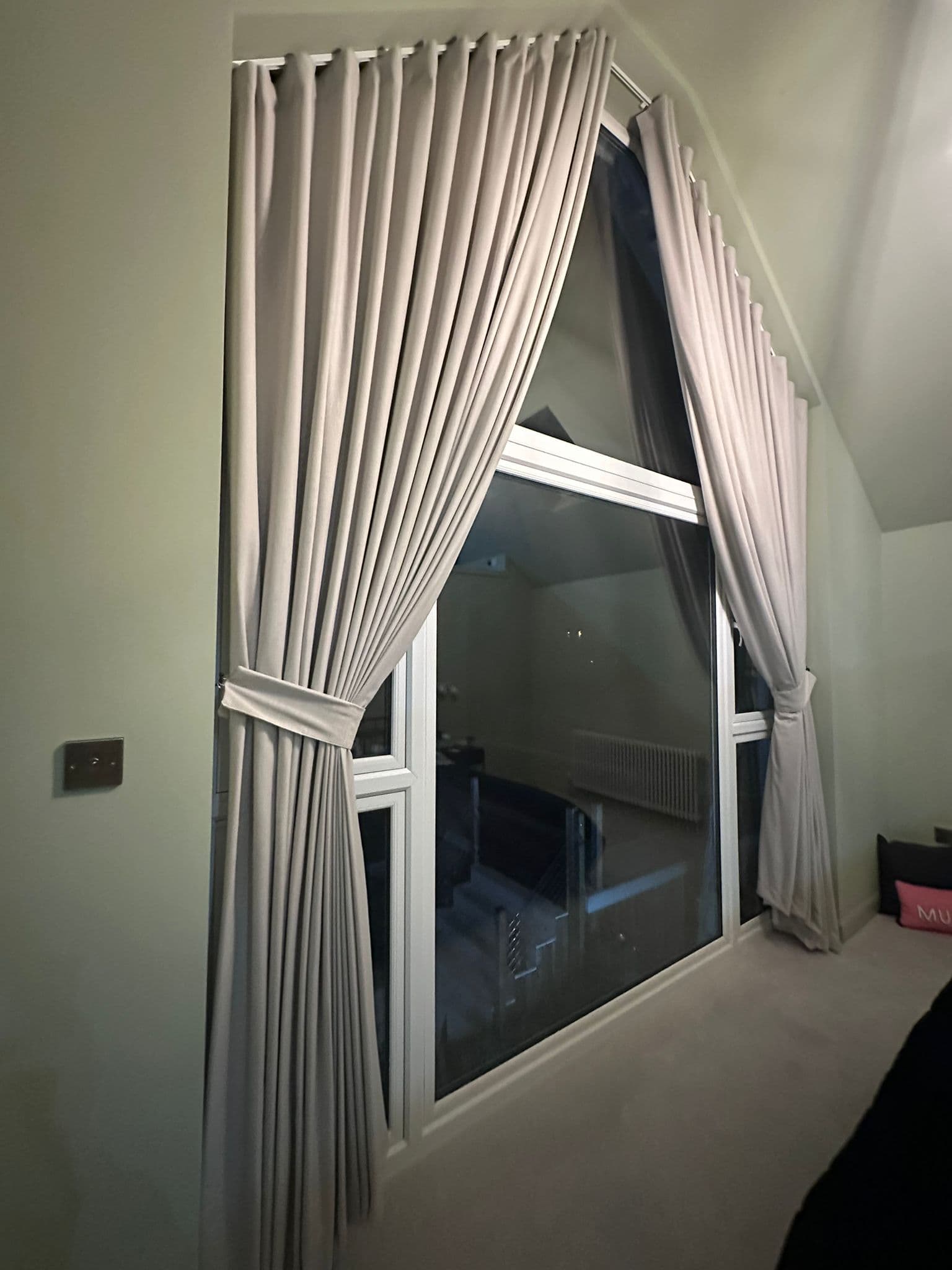
In the neutral installation shown below, the pale cloth gains depth through shadow. Matching tiebacks keep attention on the long folds rather than introducing a separate accent.
Apex installation photography · Warm ivory and pale walls, with depth created by the folds.
Olive can connect a room to the planting outside, especially where the window is a strong feature. Pairing it with chalk or warm stone allows the curtain to have presence without making every surface compete. A muted green can also sit comfortably with natural timber; compare the wood’s red or yellow undertone before committing.
Muted blue can create a cooler, more defined frame. Warm wood, soft cream or a small clay-coloured accent can balance it. A deep blue on a very large curtain may feel more enveloping than the same colour on a small sample, particularly in evening light.
These are design directions, not rules about which colours belong in which room. A north-facing room, warm lamps or coloured reflections from outside can change the balance. Choose the shade and intensity in context.
View fabric in morning, afternoon and evening conditions, including the lamps you actually use. Hold it vertically at the window, then away from the glass. Backlighting can change its apparent opacity and colour; the lining can change that again.
A matte weave and a lustrous fabric in similar colours can feel completely different. Sheen catches light across a fold, while textured cloth breaks it into smaller variations. Pile direction can create another change in tone. On a tall curtain these effects repeat over a large area.
Consider the closed curtain as a wall of colour as well as the open curtain as a frame. The amount of fabric on view changes when tied back. If the reverse becomes visible, a coloured lining can make that moment feel intentional.
A plain colour is not necessarily a plain surface. Weave can introduce fine variation, and folds add a repeated rhythm of light and shade. Oslo is useful to explore as a woven colour range; the swatches above help compare shades, while a physical hanging sample shows the handle and fold.
A linen-look description concerns appearance and does not identify the fibres. Oslo, for example, is listed by PT as a cotton and polyester blend. Its Linen colour name should not be confused with a linen fabric. Always assess the exact cloth, especially where movement or a precise floor finish matters.
A small pattern may blend into texture when seen from the floor of a tall room. A large repeat remains more visible, but its position on sloping edges, across joins and at the heading needs planning. A bold motif can be interrupted by the shape of a triangular curtain or hidden in a fold.
Joins are part of making a wide curtain from narrower cloth. PT lists Oslo at 140 cm nominal width, 138 cm usable; that does not become a seamless 4–6 m drop by turning the cloth sideways. Railroading is a construction decision requiring suitable width, direction and manufacturer guidance, not an automatic way to avoid seams.
Shortlist a few directions and compare them in the room rather than collecting dozens of almost identical swatches. A larger hanging sample is especially useful for tall glazing. Put the proposed lining behind it and gather a few folds so you see light and shade together.
Place the sample beside the wall, floor and main upholstery.
Stand at the doorway and the normal seating position; step back from the sample.
Compare daylight with evening lighting, and open with closed-curtain proportions.
Review heading, lining and tieback colour as one scheme.
Confirm the physical cloth and colour reference before ordering; screen colours and photographs are approximate.
They can, but an exact match is not necessary. A tonal relationship creates continuity, while a deeper or contrasting curtain can frame the window. Compare undertones and texture in the actual room.
Will a curtain colour look the same as its online photograph?
Not reliably. Screens, photography, daylight, lining and fabric texture all affect appearance. Make the final choice from physical samples in the room.
Are dark curtains unsuitable for large windows?
Not automatically. Deep colours can frame large glazing beautifully, but their visual area and the room’s light need consideration. View a generous sample from across the room.